The creation of the Buffalo Nickel, and how the 1913 Buffalo Nickel made it into production, was shaped by the Coinage Act of 1890. This Act restricted the redesign of U.S. coins to once every 25 years unless authorized by Congress. By the early 20th century, calls for new coin designs were growing, fueled by President Theodore Roosevelt’s displeasure with the circulating designs. Reformers and artists pushed for coinage that reflected American heritage, moving away from the repetitive and utilitarian designs of the previous era. Treasury Secretary at the time, Franklin MacVeagh, embraced this momentum, advocating for changes that would bring more artistic and culturally significant imagery to U.S. coins.
Motivation for the Buffalo Nickel
The Liberty Head nickel preceded the Buffalo Nickel and was in production from 1883 to 1912. Designed by Charles E. Barber, this nickel featured a representation of Lady Liberty wearing a crown on the obverse and the Roman Numeral ‘V’ on the reverse. By 1912, it was viewed as outdated, and public opinion was in support of redesigning the coin. A new design was sought to symbolize America’s identity, emphasizing its natural landscapes and indigenous peoples. The Buffalo Nickel was intended to evoke pride and acknowledge the nation’s heritage through its bold imagery.
Designer of the Buffalo Nickel
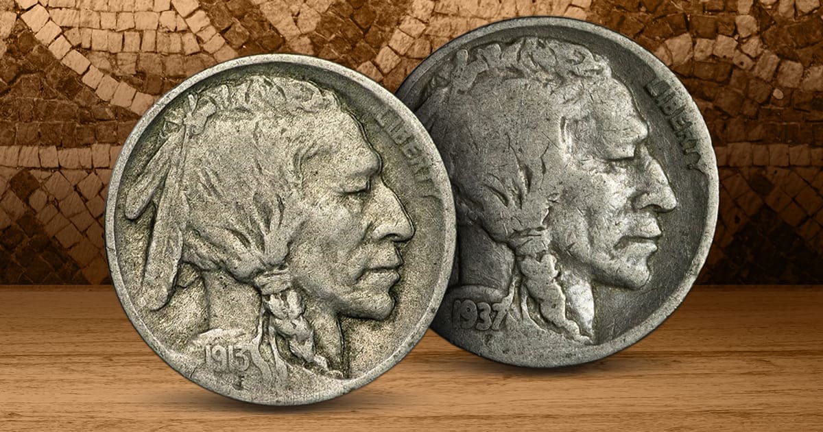
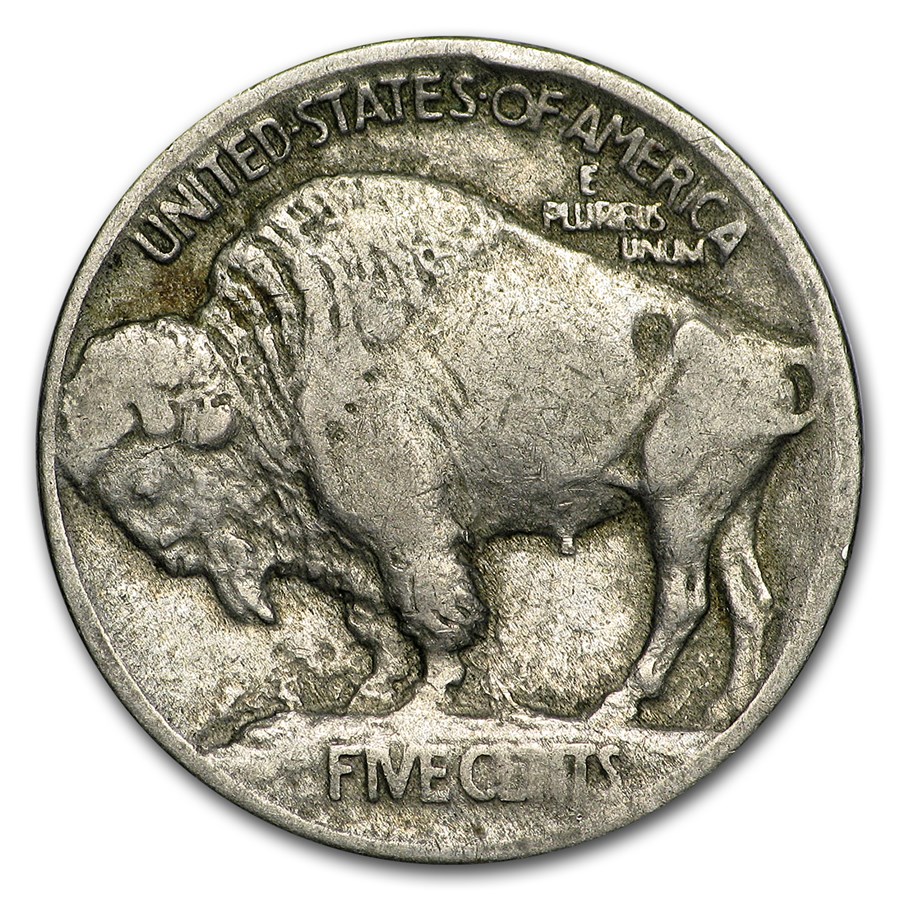
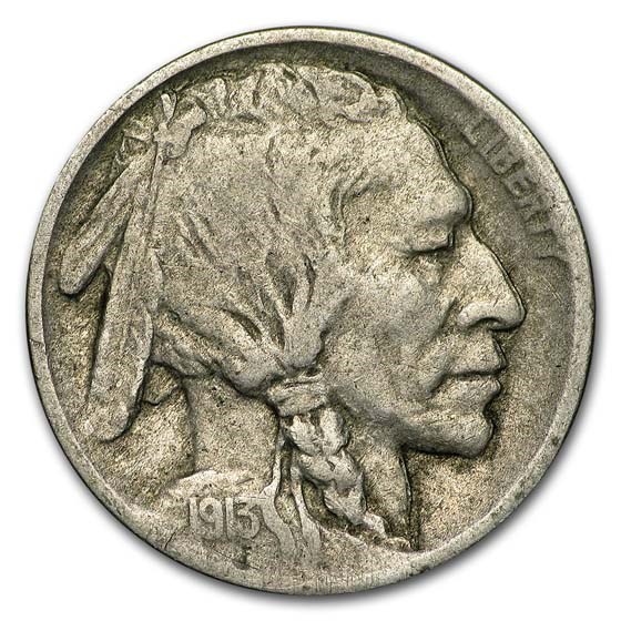
James Earle Fraser, a prominent sculptor and former student of Augustus Saint-Gaudens, was selected to design the new coin due to his reputation for creating works with a distinctly American character. Fraser’s expertise in depicting Native American themes and wildlife made him an ideal choice. His selection was influenced by his prior achievements and the recommendation of influential figures in the art community. For the obverse, he created a composite portrait of three Native American chiefs: Iron Tail, Two Moons, and likely Big Tree. The reverse featured an American buffalo named Black Diamond, a well-known animal that resided at Central Park Zoo in New York. Fraser’s designs were praised for their balance of artistic merit and cultural symbolism.
The Design Process and Approval
James Earle Fraser presented three initial sketches of the Buffalo Nickel to the Treasury Department in 1911. A slow approval process resulted in Fraser being commissioned in 1912, with MacVeagh communicating the department wished to proceed with designs of the Indian head and buffalo. The design underwent several revisions based on feedback from government officials and the U.S. Mint to address concerns about practicality and mass production. While the artistry was celebrated, the coin’s high-relief details raised concerns about minting. Despite the challenges, the design was approved for production due to its symbolic importance and visual appeal.
Challenges in Production
The detailed design of the Buffalo Nickel posed significant challenges at the U.S. Mint. The high relief caused dies to wear out quickly, leading to frequent replacements and increased production costs. The intricate details often resulted in weak strikes, with parts of the design appearing faint or uneven. These issues created frustrations, but the coin’s artistic impact mitigated much of the criticism. Over time, modifications were made to improve production efficiency, though issues persisted throughout its minting.
The Coin’s Release in 1913
Production of the Buffalo Nickel began in 1913 at the Philadelphia Mint. Upon its release, the coin garnered widespread attention. Its design was hailed as a bold departure from previous U.S. coinage, capturing the essence of American heritage and identity. However, some critics pointed out its impracticality for vending machines and everyday commerce due to the raised design features. Despite these minor drawbacks, the Buffalo Nickel quickly became a symbol of American artistry and cultural pride.
Duration and Replacement
The Buffalo Nickel remained in production from 1913 to 1938, a span of 25 years. Over time, wear and production challenges led to calls for a more practical design. In 1938, the Jefferson Nickel replaced it, featuring a portrait of Thomas Jefferson by sculptor Felix Schlag. This change was part of a broader effort to honor American statesmen and ensure designs that were easier to produce and use in daily commerce. The new coin’s lower-relief design resolved many of the production issues that had plagued the Buffalo Nickel while introducing a modernized look.
Legacy and Impact
The Buffalo Nickel’s influence extended beyond its years in circulation. Its themes of Native American heritage and wildlife inspired the American Gold Buffalo, introduced in 2006. The Gold Buffalo features the same iconic design by James Earle Fraser but is has a purity of .9999 fine gold, making it the first pure gold coin produced by the U.S. Mint for investors and collectors. This modern adaptation highlights the enduring appeal of Fraser’s work and its significance in U.S. numismatic history. The Buffalo Nickel remains a favorite among collectors, celebrated for its artistic and cultural contributions to American coinage.


